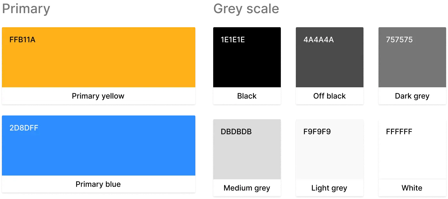
0%

TasteBuds

How can we help diners make quick, confident decisions?

Involvement

  • Product designer
  • UX researcher
  • UX/UI designer
  • Service designer
  • Interaction designer
  • UX writer

Disciplines

  • UX/UI design
  • Growth design
  • Branding
  • Product strategy
  • Monetization strategy

Timeline

  • Dec 2022 - June 2023

Tools

Notion logo

The challenge

"Why is it so hard to find a place to eat?"

We’ve all been there—hungry and overwhelmed, scrolling through endless Yelp results, discerning fake and conflicting reviews, and avoiding ads. Our friends claim they’re “okay with anything” but veto every suggestion. Often times, when we do make a decision, we wonder if we’re missing out on something better ...

Dining out should be simple—but most of us scroll endlessly through Yelp and Google, sifting through fake or irrelevant reviews. We trust our friends more than strangers, but word-of-mouth is hard to access efficiently.

So, how might we help diners make quick, confident decisions?

How might we leverage trusted recommendations?

The process

Over a 6 month period, I followed the 5-stage Design Thinking model from Stanford's d.school to research, design, and prototype TasteBuds.

Discover dining experiences with personalized recommendations and trusted friends.

The final solution empowers diners to confidently discover dining options with people they trust. Leveraging word-of-mouth recommendations from friends, Tastebuds provides personalized recommendations based on diners' preferences and dining history.

B2B business model that provides restaurant subscribers access to user data and feedback

To generate a revenue stream without overcommercialization and improve the overall diner journey, TasteBuds invites restaurants to join as business partners to offer exclusive in-app promotions and stay connected with diners.

secondary and market research
Exploring the landscape

I began research by reviewing existing literature and Google keywords on consumer dining and choice paralysis.

This allowed me to learn about emerging and evolving diner habits and preferences in 2022:

Secondary Research Findings

  • If the restaurant's food is good, then the service doesn't matter to diners.
  • Word-of-mouth recommendations are more trusted than online reviews.
  • Although 73% of diners use online reviews, only 24% are influenced by them.
  • The majority of diners visit a restaurant's online menu and website first.
  • Promotions strongly influence diners' decisions.

When making dining decisions, these are the top 3 considerations:

Type of food

Location/Distance

Word-of-mouth

By the end of my secondary research, I began wondering: Why don't diners trust online reviews? Why do diners still resort to them?

primary research
Surveying and interviewing dissatisfied diners

Drawing from my secondary research, I formed a few assumptions to validate in user research.

01

Diners are most frustrated by their limited discovery and timely decisions.

02

Infinite search results, overcommercialization, and fake reviews can create decision paralysis for diners.

03

Diners want a more trustworthy, personalized, and food-focused alternative.

These helped me craft a screener survey that recruited diners for interviews and collected qualitative and quantitative data on 4 different aspects of dining out. I kept these assumptions at the back of my mind as I navigated the rest of user research, as I didn't want them to create bias.

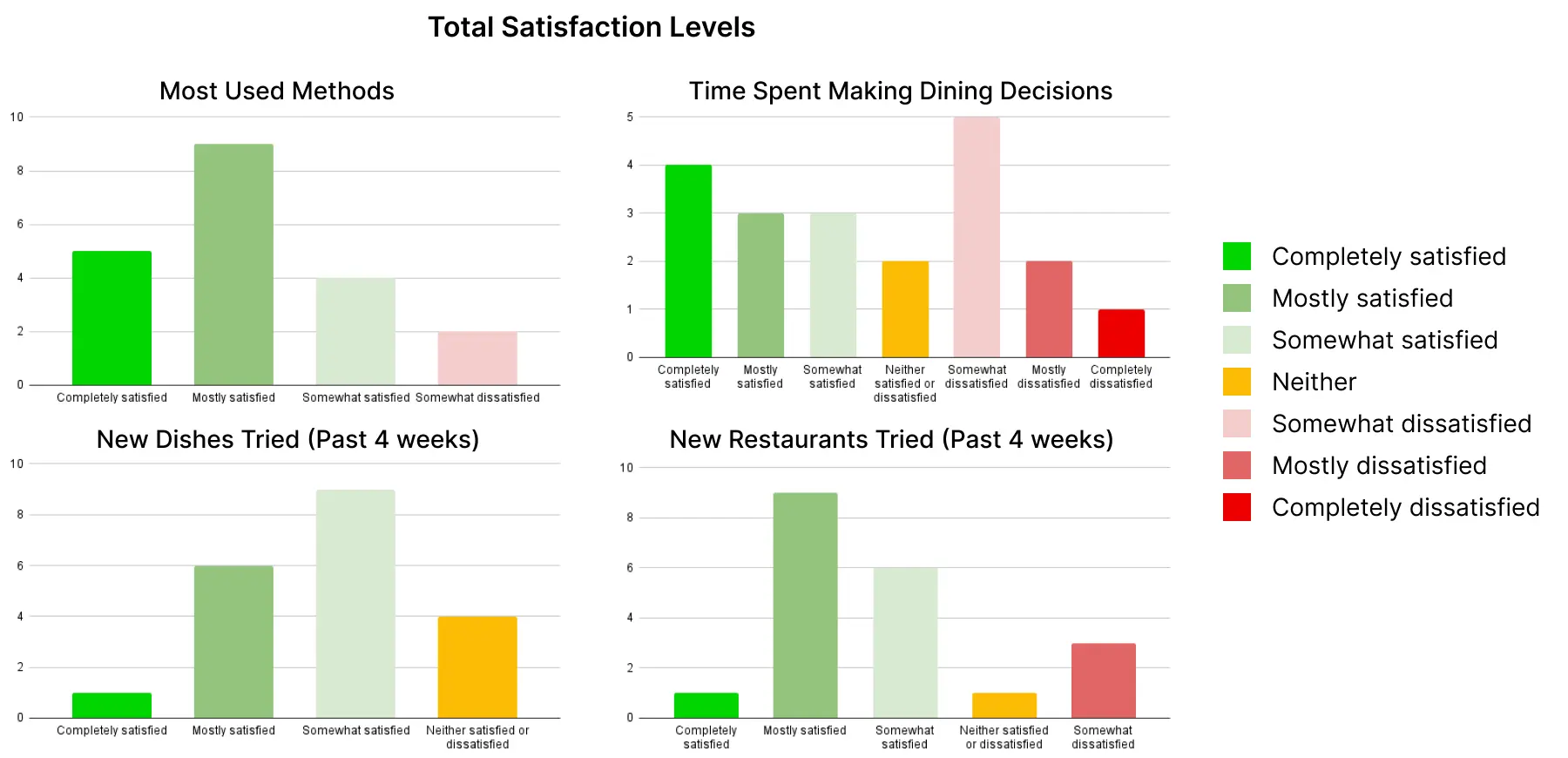
I surveyed 20 participants and conducted 7 semi-structured interviews with the most dissatisfied diners.

Diners' satisfaction levels: (1) Methods used for dining decisions, (2) time spent making decisions, (3) new dishes tried past 4 weeks, and (4) frequency of trying new restaurants.

Completely satisfied

Mostly satisfied

Somewhat satisfied

Neither

Somewhat dissatisfied

Mostly dissatisfied

Completely dissatisfied
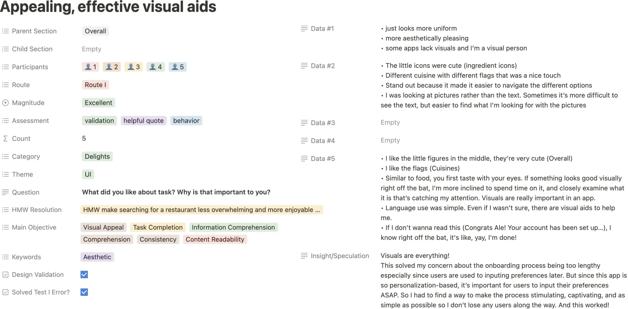
Survey Findings

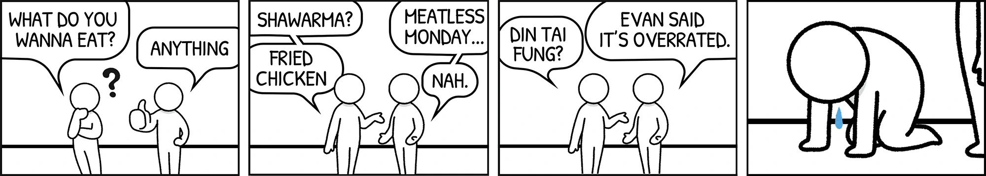
At a high-level, my survey found that the largest painpoint for diners is making decisions. My findings really helped me structure my user interviews to delve deeper into diner experiences.

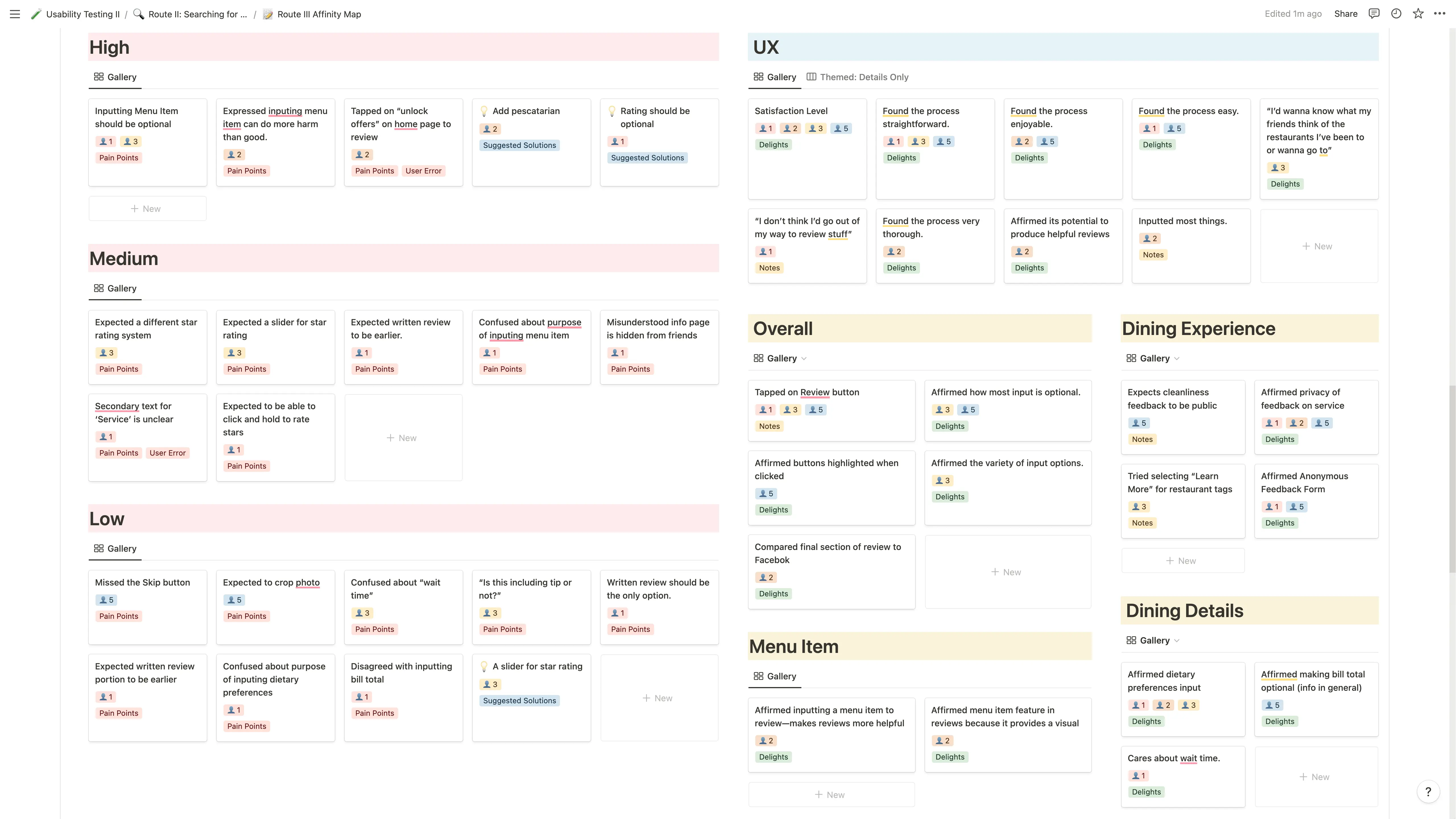
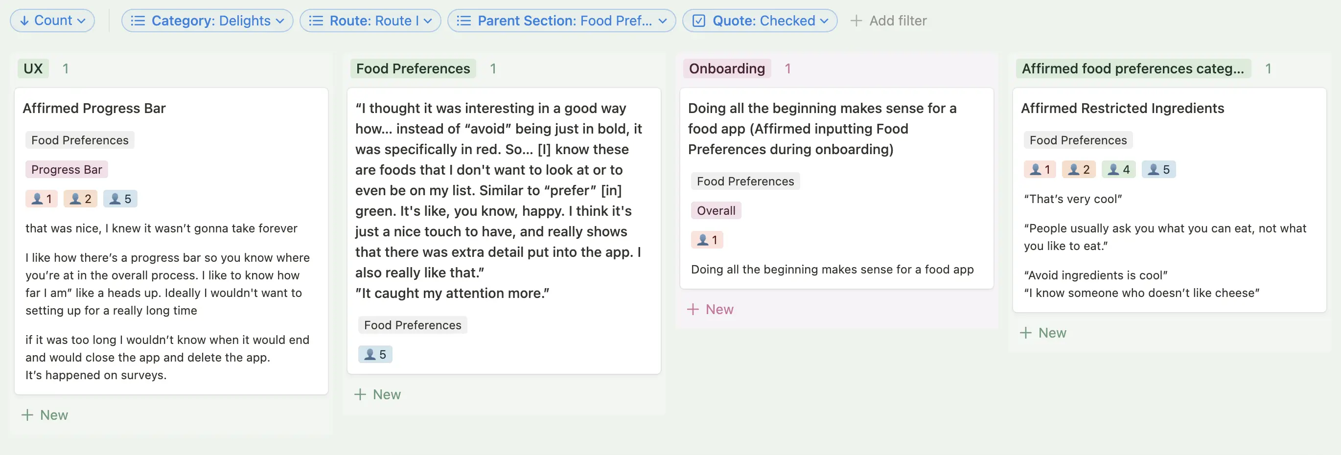
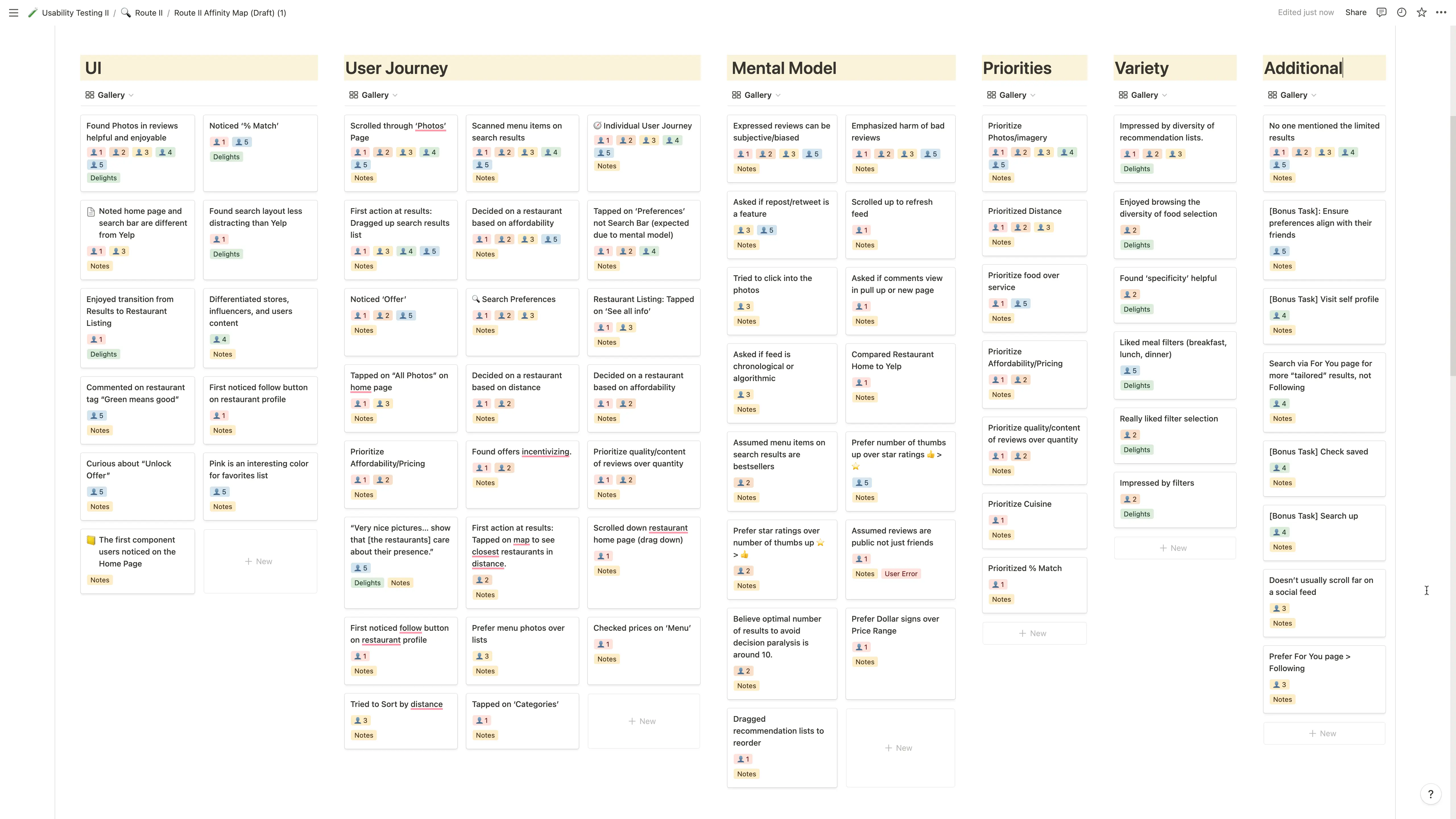
The interviews were very insightful! Using FigJam, I synthesized the interview data with an affinity map.

Below is a summary of what I unconvered on diners' delights and painpoints:

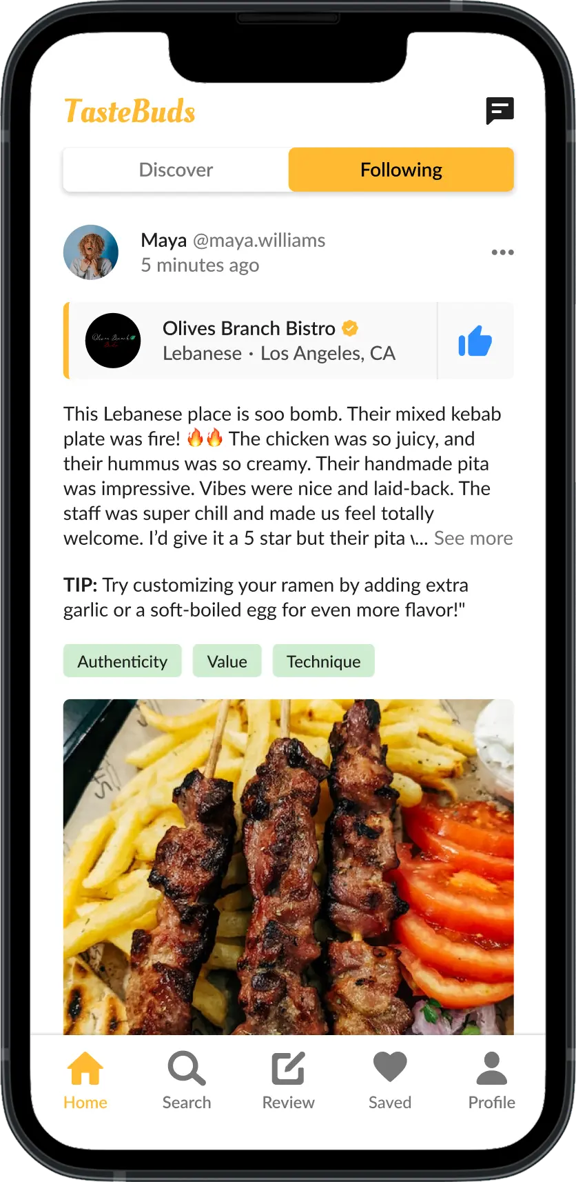
There's a certain emotional trust about talking to someone about it...

If I had a magic wand, I’d want to receive suggested items that would suit my tastes.

If I had a magic wand, I’d want to receive
suggested items that would suit my tastes.

Conclusion

My research validated all of my initial assumptions except for one. Diners are more focused on their struggle to confidently making decisions than discovering new dining options. As I expected, discovery is still a significant pain point, but decision-making takes precedence because it is the most critical roadblock in their journey.

Competitor Analysis
Learning from my competitors

To understand how current tools shape the dining out experiences, I analyzed Yelp and Google Maps.

I assessed the features, user flows, content strategy, and information architecture of their search and review flows.

Competitor Analysis Findings

  • Yelp: Cluttered UI, excessive sponsored content, and complex navigation.
  • Google Maps: Intuitive interface but lacks filtering and sorting options.
  • Yelp & Google Maps: Becoming more system-centric (overcommercialization), not tailored specifically to diners.
  • Word-of-mouth recommendations: Most reliable but most inaccessible.

Defining the problem

synthesis
Connecting the dots with a mind map

To better guide the Define stage, I created a mind map to connect my research findings and focus my insights.

In sum, diners lack confidence due to unreliable content and inaccessible word-of-mouth recommendations.

user personas
Meet the diners:
Alex, Brandon, and Cleo

Given the diversity of diners' needs and behaviors, I created 3 user personas to better understand my target audience and guide my ideation phase: Alex, Brandon, and Cleo. The mind map I created earlier helped me clarify the distinct pain points and delights of each persona!

Spoiler alert: In hindsight, this was the beginning of my scope creep. Eventually, I narrowed my focus to Alex and Brandon to ensure a more targeted and effective product experience.

Alex

I love dining out. I get to spend quality time with friends and family while enjoying and discovering delicious food . Sure, I use Yelp and Google Maps, but I trust word-of-mouth recommendations over online reviews to know what's actually good . Authenticity and quality are key!

Brandon

I prioritize convenience over discovery due to my hectic work schedule. I dine out or order takeout for quick, good-value options , especially when working late or when I don’t have time or energy to cook.

Cleo

I love dining out to discover new, trendy places and spend quality time with friends and family. Convenience doesn't matter —I’m willing to go the extra mile if the experience is worth it! So I don’t dine out just for the food: As a remote worker, I look for aesthetic coffee shops with WiFi and outlets, so accurate online details and high-quality photos essential.

Despite their differences, Alex, Brandon, and Cleo have something in common: They feel overwhelmed by endless search results that are irrelevant to their needs and desire more personalization in their search methods.

How might I empower diners to confidently discover dining options and make decisions?

USER STORIES
What functionalities do Alex, Brandon, and Cleo desire?

To narrow the scope, I created user stories to help me empathize with the needs of Alex, Brandon, and Cleo and start envisioning how my solution could empower them. Here are the highlights:

I want to easily get recommendations from friends, so I can confidently try new places.

I want personalized recommendations, so I can discover and explore options that suit me.

I want to search for options with more customization like filters, so I can avoid decision paralysis.

I want to write reviews that are visible to my friends only, so I can share my opinions comfortably.

user flow
How do I make diner stories a reality?

Since diners typically explore options with Yelp and Google, I decided to prototype a mobile-app for my solution. Using the new diner stories, I brainstormed features and conceptualized 3 user flows to visualize how diners like Alex, Brandon, and Cleo would interact with the product to enhance their dining experience.

Diner signs up and sets up their account

  • Create account via email or social
  • Input food preferences
  • Add friends

After a standard sign-up process, diners are guided to input their food preferences and add their friends by linking social media accounts and contacts. This facilitates personalized dining recommendations and access to recommendations from friends.

Diner explores options

  • Saved search presets
  • Personalized recommendations
  • Compatibility score (% Match)
  • Limited refreshable results

To explore dining options, diners navigate a search flow facilitated by a new or saved search with food-focused and user-based filters. After inputting preferences, diners will find a finite list of results sorted by a compatibility score.

Diner reviews their dining experience

  • Rate restaurant and dishes
  • Strengths and weaknesses
  • Recommendation feedback
  • Written review (optional)

Diners follow a step-by-step review flow focused on providing feedback on the restaurant and dishes, featuring a unique 0-5 star rating system in 0.5 increments. Since reviews contribute to AI recommendations, diners can make any review private, allowing them to improve suggestions without sharing select opinions with friends.

information architecture

Optimizing navigation for the diner journey

Using the user flows, I began developing my app's information architecture. I planned on implementing a bottom navigation bar, so I first brainstormed the app's top-level destinations with a few secondary-level content:

Home

  • Cuisine quick links
  • AI recommendations
  • Offers & promotions

Social feed

  • Friends' reviews
  • Inbox
  • Write a review

Search

  • New search
  • Saved search
  • Search results

saved

  • Saved restaurants
  • Create collections
  • Saved reviews

profile

  • User's reviews
  • Food preferences
  • Account settings
design

Exploring and refining through sketching

While sketching how my ideas would come together for diners, the challenge was ensuring the user flows would compose an efficient and resilient ecosystem for the solution. Essentially, all of my user flows are connected: Each user flow supply and utilize user-generated data from each other. For example, I spent a lot of time figuring out the user data needed to tailor dining recommendations and exploring how the user flows would individually and collectively support these data sets.

Guiding questions

  • What critical user data is needed to tailor dining recommendations?
  • How can the search feature optimize and empower dining decisions?
  • How can I minimize cognitive overload while maximizing engagement for the structured review flow?

How can the search feature optimize and empower dining decisions?

Four sketches of a mobile app interface for finding Taiwanese restaurants.

Four sketches of a mobile app interface for finding Taiwanese restaurants.


test
Rapid prototyping and testing new sketches

Before moving onto low fidelity explorations, I quickly prototyped my sketches and conducted 5 guerilla usability tests for the search and review flows.

Successes

  • All users praised the personalized recommendations
  • All users mentioned and affirmed the restaurant "deal" feature
  • All users found the search and review flows intuitive
  • All users wished this tool existed

Errors

  • 3 users didn't notice the map behind the list of results
  • 4 users struggled with the slider design to rate stars

Notes

  • 1 user mentioned they avoid ingredients they dislike
  • 1 user said they use the map for location-based searches

low-fidelity
Iterating sketches through low-fidelity wireframes

Using my testing insights, I iterated my sketches into low-fidelity wireframes and designed new screens.

I was worried about drop-off rates during onboarding given the multistep process, so I designed a new linear process supported by a progress bar and a modal checkpoint . To further support AI recommendations, I added a step for users to input ingredients they simply dislike but are not allergic to.

My iterations for the search flow focused on facilitating intuitive explorations of dining options, prioritizing scanability and above-the-fold design. I designed the home page (for you), a new split-view for results, a new restaurant preview carousel, and wireframes for each restaurant subpage. The most challenging screen to design was the reviews page due to the amount of content each review needs to display.

My iterations for the review flow aim to make the process more engaging and streamlined. I reduced the flow from 7 screens to 4 screens. I enhanced and added a few features to support the process, such as a progress bar, option to save and finish later, and natural language copy. I also redesigned the star rating interaction and standardized the rating system with descriptive labels for each level.

Previous


Iteration

prototype
Branding and prototyping high-fidelity wireframes

branding
Style guide

In branding my solution, I wanted to foster warmth, friendliness, trust, excitement, and a sense of community with my color palette.

Initially, I considered red, which is used by McDonald's and Yelp to stimulate appetite and spending. However, since my app focuses on building trust through personal recommendations, I chose a sunflower yellow to encourage social interaction and exploration, paired with sky blue for familiarity in social media.

Spoiler Alert: I later realized my typography was too small. It was a pain to readjust my wireframes since I didn't know to use Figma's public library tool. This was a hard lesson to learn!

Color Palette

Typography

Buttons

Badges

8-point-grid

design

High-fidelity prototype

With my new style guide, I designed high-fidelity wireframes and prototyped them for my next round of usability tests. A key objective in my high-fidelity explorations was enhancing accessibility, so I reviewed Apple's Human Interface Guidelines for Accessibility and Web Content Accessibility Guidelines (WCAG) . My learnings guided me to significantly increase spacing and physical interactions when possible , supporting both users with limited mobility and power users.

I implemented more conversational UI and visual aids and further streamlined the user flow.

I enhanced my business goals by conceptualizing restaurant partnerships and their role in the diner journey! I enhanced social proof elements, added more engagement features, and developed the 'Redeem offer' screen.

Diners can add media and tag them with menu items and/or friends so users can quickly look up dishes.

test
Testing and iterating

To test my high-fidelity prototype and gather feedback for iterations, I conducted 5 remote moderated usability tests. The participants were diners between the ages 21 and 30 who dined out at least once a week and used at least one online method to find dining options.

Tasks

  1. Onboarding : Create an account using your Facebook login.
  2. Search : Find a restaurant to dine at within 3 miles of your current location.
  3. Review : Write a 4.5-star review with a photo for Olives Branch Bistro, where you had a Mixed Kebab Plate.

Successes

  • All users praised the visual and interaction design.
  • All users prefer TasteBuds over tools like Yelp.
  • All users loved the personalization and customization features
  • All users found TasteBuds informative, diverse, and inclusive.
  • All users reported the visual aids enhanced scanability and encouraged them to complete the flows

pain points and confusion

  • All diners misinterpreted the app premise by the end of onboarding.
  • 4 diners overlooked and/or were confused by the onboarding copy.
  • 3 diners struggled to rate stars.
  • 3 diners struggled to find the review page and found the flow lengthy.
  • 3 diners missed the change between ingredient preference steps
  • 2 diners assumed preferences limit discovery.

Notes

  • 2 users explored the home page to search for dining options
  • 1 user searched for dining via cuisine filter buttons on the home page
  • Most users expressed they prefer detailed reviews
  • Findings remain consistent with primary and search research insights

With new insights, I enhanced my prototype with iterations to resolve the user pain points and confusion, while expanding my business partnership concept and its integration into the user flows.

test and iteration

Final round of testing

Methodology

For my final round of testing, I conducted 5 remote moderated tests with my iterated prototype. The participant profile and assigned tasks was the same as the previous test. I was very interested in seeing if there are any unintended use cases.

Affinity Mapping

For data synthesis, I wanted to challenge myself and generate some quantitative data. While 5 tests don't yield substantial data, I wanted to experiment with Notion to identify patterns and themes via keywords.

Using Notion's variety of ways to view data, I generated affinity maps for each flow:

This turned out to be quite productive because Notion allowed me to filter and arrange data to quickly identify patterns. For example, using the count property, I could tally participants and sort data to visualize the most recurrent issues. The tags helped me pinpoint themes and locate data quickly, making the process much easier.

Feel free to take a look at my database here !

Findings

Overall, diners were impressed by TasteBuds! They praised the personalization features and how TasteBuds leverages word-of-mouth recommendations. My iterations resolved all previous errors. The only issue was that some users found nonessential parts of the review UI confusing. One diner said:

I usually use Google Maps. . . I don't think there’s really any filtering. Sometimes you can be overloaded with all the results. No other apps have filters as extensive… If I had this app, I'd totally use it all the time. I really like the different filters.

Participant 02

I like how there's a lot of options in general. It’s very detailed. The whole point of the review is to provide details to people. The way it’s set up can help people understand someone’s experience at the place. It was very comprehensive, but also gave you the optionals. You can decide how much of a review you wanted to write.

I like how there's a lot of options in general. It’s very detailed. The whole point of the review is to provide details to people. The way it’s set up can help people understand someone’s experience at the place. It was very comprehensive, but also gave you the optionals. You can decide how much of a review you wanted to write.

Participant 01

Successes

  • All pain points and confusions from the previous test were resolved!
  • All diners praised the personalization features and inclusive/diverse content.
  • All diners found the new visual aids helpful and engaging to help content comprehension and task completion.
  • 3 diners intuitively explored dining options outside of the primary flow.
  • All diners prefer TasteBuds over their existing tools!

pain points

  • 3 users found nonessential parts of the review UI confusing

Discover dining experiences with personalized recommendations.

The final solution empowers diners to confidently discover dining options with people they trust. Leveraging word-of-mouth recommendations from friends, Tastebuds provides personalized recommendations based on diners' preferences and dining history.

Explore individual dining experiences from friends.

Diners can explore individual recommendations from friends on their following page and visit other diner profiles for

B2B business model that provides restaurant subscribers access to user data and feedback

To generate a revenue stream without overcommercialization and improve the overall diner journey, TasteBuds invites restaurants to join as business partners to offer exclusive in-app promotions and stay connected with diners.

Play with my prototype! Select any user flow from the left hand panel.

What's next?

If I had more time, I would collaborate with engineers and data scientists to assess technical feasibility, iterate on the prototype, and test it in real-world contexts—such as how diners review their experiences with TasteBuds. My goal would be to evolve the prototype into a true MVP, refine the UX ecosystem, and balance innovation with established mental models. I'm also interested in exploring features like a thumbs up/down rating system and designing for edge cases.

If I had the opportunity to ship this product with a team, I’d prioritize refining the business strategy and developing a prototype for restaurant partners. This would integrate them more meaningfully into the user journey and optimize partner touchpoints based on additional research. Through interviews and surveys with restaurant owners, we could tailor features to support seamless, high-value interactions on both sides of the platform.

Learnings

This usability test taught me a lot about my design solutions and design thinking. I uncovered some of my most significant mistakes and weaknesses as a designer and as an individual that contributed to the issues:

Rely on testing and avoid excessive prototyping

This project highlighted the power of usability testing in optimizing the design process. Initially, I made the mistake of spending long hours prototyping alternative user flows instead of focusing on testing. Effective and strategic testing can significantly save valuable resources!

Mental models can change

I learn that we don't need to follow mental models so closely as they can cost innovation. I was pleased to learn that people are willing to challenge their mental models for compelling alternatives, especially for painkiller products. After all, industry standards are always evolving. As a designer who values innovation, this was a critical and motivating lesson.

New love for UX ecosystems

I developed a deep appreciation for UX ecosystems and symbiotic user flows. Although navigating them for the first time was challenging, it revealed my natural ability to consider technological constraints in design—something I’m eager to apply in a cross-functional team.

Iterate user flows

Reviewing other UX case studies made me realize a lot of designers tend to ideate in a linear process, but I found that it's valuable to reiterate techniques like user flow maps and user personas through testing to maintain scope. This also helps track iterations, which would save so much time on case studies.

Reflection

This was my first exposure to product design, and it was incredibly rewarding for my growth as a designer. Applying my UX training allowed me to experience how different techniques support the design process and helped me identify which methods work best for me. I also discovered that my background in sociology and business strongly complements this field, empowering me to conduct thorough research and design solutions that balance user and business needs

Moving forward, I plan to deepen my understanding of UX ecosystems and testing strategies to further optimize my design process. Designing TasteBuds solidified my core values as a designer: humility, innovation, and continuous growth. I’m excited to apply these lessons to future projects and teams!